Sports Team Fonts: Top Picks for Winning Designs
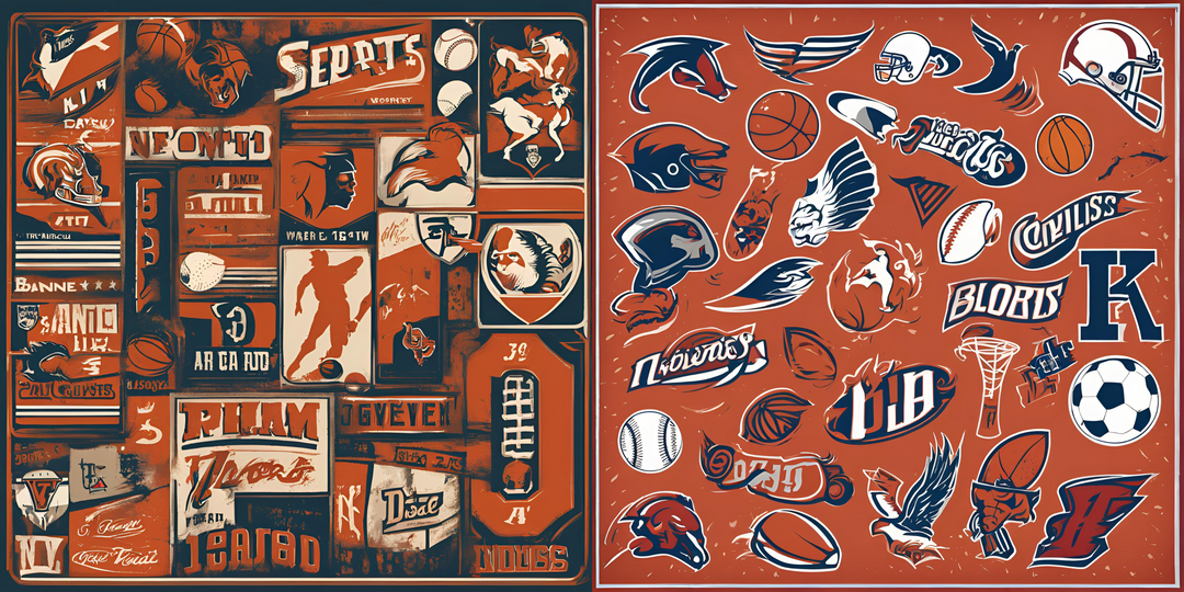
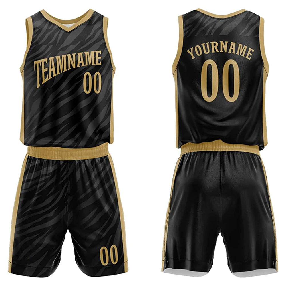
Did you know that the right athletic block fonts can make or break a sports team's image? Choosing the perfect typography for jerseys, logos, and promotional materials can significantly impact a team's branding and fan engagement. In the competitive world of sports, every detail counts, including the fonts used to represent a team's identity. Sports team fonts play a crucial role in conveying the team's personality, style, and competitiveness to fans and rivals alike. From bold and aggressive typefaces to sleek and modern designs, each font choice tells a unique story about the team it represents.
Key Takeaways
-
Choose Wisely: Selecting the right font for your sports team branding is crucial for conveying the desired message and creating a strong visual identity.
-
Stick to Tradition: Popular sports fonts like classic sans serif options and timeless serif choices provide a sense of familiarity and professionalism to your team's image.
-
Embrace Creativity: Incorporate trendy script fonts, retro, vintage selections, and bold typography to add personality and uniqueness to your sports team's visual representation.
-
Stand Out: Opt for custom and unique fonts to differentiate your team from others and leave a lasting impression on fans and supporters.
-
Consistency is Key: Maintain consistency in font usage across various platforms and materials to build a cohesive and recognizable brand identity.
-
Experiment Responsibly: While exploring different font styles, ensure they align with your team's values and resonate with your target audience for maximum impact.
Importance of Choosing the Right Font
Brand Identity
Choosing the right font for a sports team is crucial as it directly impacts brand identity. The font used in a team's logo, jerseys, and promotional materials plays a significant role in how the team is perceived by fans and the general public.
The font selected should align with the team's overall image and values to create a cohesive and memorable brand presence. Consistency in font usage across various platforms helps in establishing a strong visual identity that fans can easily recognize.
Typography Role
Typography goes beyond just letters and words; it conveys the personality and values of a sports team. The style, size, and spacing of the font can evoke different emotions and perceptions. For example, bold and modern fonts may convey a sense of strength and competitiveness, while elegant cursive fonts might suggest sophistication and tradition.
By selecting an appropriate font, sports teams can communicate their unique identity to fans and create a lasting impression that resonates with their target audience. The sports font chosen should reflect the team's ethos and resonate with supporters on an emotional level.
Influence of Technology
Modern technology has revolutionized font accessibility and design trends for sports teams. With the advent of digital tools and software, teams now have a wide array of fonts to choose from, allowing for more customization and creativity in branding by easily downloading them.
Teams can experiment with different fonts, styles, and colors to find the perfect match that encapsulates their essence. Moreover, advancements in technology have made it easier to create custom fonts tailored specifically to a team's requirements, further enhancing their brand uniqueness.
Popular Sports Fonts
Versatile Fonts
Sports team fonts are highly sought after for their versatility. They can be used across various sports, from basketball to soccer, due to their adaptability. These fonts are designed to convey a sense of energy and movement, making them perfect for sports branding.
Key Characteristics:
-
Adaptability: These fonts can be used for a wide range of sports, ensuring flexibility in design.
-
Dynamic: The fonts often feature bold and dynamic styles that capture the essence of sports.
-
Energetic: They exude a sense of energy and motion, reflecting the dynamic nature of sports.
Impactful Logos
Great sports font choices play a crucial role in creating impactful logos for sports teams. They are carefully crafted to evoke a sense of strength and competitiveness, aligning with the team's identity. These fonts help establish a strong visual presence for the team, making them instantly recognizable.
Key Characteristics:
-
Strength: The fonts convey a sense of power and determination, reflecting the team's competitive spirit.
-
Recognition: A well-chosen font contributes to the team's brand recognition and memorability.
-
Unity: The font unifies the team's visual identity, creating a cohesive look across various branding materials.
Excitement and Fan Engagement
Premium sports fonts are essential for generating excitement among fans. They create a visually appealing experience that resonates with supporters and instills a sense of pride. These fonts are instrumental in building fan loyalty and fostering a strong connection between the team and its audience.
Key Characteristics:
-
Excitement: Bold typography captures attention and creates anticipation among fans.
-
Fan Engagement: The right font choice can enhance fan engagement by creating a memorable visual impact.
-
Pride: Fans take pride in sporting merchandise featuring stylish sports fonts, fostering a sense of belonging.
Classic Sans Serif Options
Clean Appeal
Sans serif fonts offer a clean and modern aesthetic that is highly appealing for sports team branding. These fonts are characterized by their lack of decorative flourishes, making them sleek and timeless choices for jerseys, logos, and other promotional materials. The simplicity of sans serif fonts allows for easy recognition and readability, crucial elements in sports branding.
Enhanced Readability
One of the key advantages of using sans serif fonts in sports branding is their enhanced readability. Whether displayed on digital screens, merchandise, or stadium signage, these fonts ensure clear communication of team names, player numbers, and other important information. The simplicity of sans serif typefaces makes them highly versatile across different mediums, maintaining legibility even at a distance.
-
Pros:
-
Clean and modern aesthetic
-
Enhanced readability across various applications
-
Versatile for different branding needs
-
-
Cons:
-
May lack the ornate details of serif fonts
-
Limited options for unique customization
-
Successful Examples
Several successful sports teams have effectively utilized classic sans serif fonts in their branding strategies. For instance, the New York Yankees iconic logo features a bold sans serif font that exudes strength and tradition. The Los Angeles Lakers also leverage a sleek sans serif typeface in their logo, reflecting a sense of modernity and sophistication.
-
New York Yankees: Known for their timeless logo with a strong sans serif font.
-
Los Angeles Lakers: Embraces a sleek sans serif sports font typeface for a modern look.
Trendy Script Fonts
Playful Appeal
Script fonts in sports branding offer a playful and dynamic appeal, setting a team's visual identity apart. These fonts often feature elegant cursive styles that add a touch of sophistication to logos and uniforms. The fluidity of script fonts can convey a sense of motion, ideal for sports teams aiming to portray speed and agility.
Sports teams leverage script fonts to evoke emotions among fans and players. The flowing nature of these fonts creates a sense of movement and energy, reflecting the excitement and passion associated with sports. When fans see a team's name or logo in a stylish script font, it can evoke feelings of pride and enthusiasm.
Successful Integration
-
Los Angeles Dodgers: The Dodgers' iconic logo showcases a bold script font that exudes tradition and excellence. The flowing script adds a touch of elegance to the team's image, resonating with fans worldwide.
-
Chicago Bulls: Known for their powerful brand identity, the Bulls incorporate a sleek script font in their logo. This choice reflects the team's strength and determination, aligning with their competitive spirit on the court.
-
New York Yankees: The Yankees' classic logo features a timeless script font that symbolizes prestige and history. This font choice has become synonymous with the team's rich legacy and success in Major League Baseball.
Visual Impact
Script fonts play a crucial role in creating a memorable visual impact for sports teams. By opting for trendy script fonts, teams can establish a unique identity that resonates with their fan base. These fonts add a level of sophistication and style to branding efforts, helping teams stand out in a competitive landscape.
Incorporating script fonts into sports team designs requires careful consideration of legibility and brand consistency. While these fonts offer creativity and flair, readability should remain a top priority to ensure clear communication of the team's name and message. Balancing style with functionality is key to creating impactful designs that leave a lasting impression on audiences.
Timeless Serif Choices
Authority and Elegance
Serif fonts have long been synonymous with elegance and tradition in sports branding. The classic serifs, with their distinctive tails and strokes, exude a sense of timelessness that resonates well with established sports teams.
When it comes to conveying authority and professionalism, serif fonts are the go-to choice for many teams. Their formal appearance adds a touch of sophistication to team logos and jerseys, helping to establish a strong visual identity on and off the field.
Balancing Classic and Modern
In the realm of sports typography, finding the right balance between classic design elements and modern aesthetics is crucial. Teams often opt for serif fonts that offer a blend of time-honored elegance and contemporary appeal.
-
Pros:
-
Conveys tradition and heritage
-
Adds a touch of sophistication
-
Establishes a strong visual identity
-
-
Cons:
-
May appear too formal for some audiences
-
Limited flexibility in certain design contexts
-
Examples of Successful Integration
Several renowned sports teams have successfully integrated serif fonts into their branding strategies. For instance, the New York Yankees iconic logo features a bold serif typeface that symbolizes the team's rich history and legacy in baseball.
-
Boston Celtics: The Celtics' logo incorporates a classic serif font that reflects the team's longstanding presence in the NBA.
-
Manchester United: Known for its global fan base, Manchester United's logo utilizes a sophisticated serif typeface that conveys a sense of prestige.
Retro and Vintage Selections
Nostalgic Appeal
Retro and vintage fonts in sports team branding evoke a sense of nostalgia, connecting fans to the team's history. These fonts often reflect the design trends of past eras, resonating with fans who appreciate tradition.
Teams that opt for retro fonts tap into the sentimental value associated with older designs. By using vintage typography, teams can create a timeless aesthetic that resonates with both long-time supporters and new generations of fans.
Cultural Significance
Retro and vintage fonts go beyond aesthetics; they carry cultural significance. Fonts inspired by different eras can symbolize specific time periods or movements, adding depth to a team's visual identity.
Embracing retro fonts allows sports teams to pay homage to their roots and celebrate their heritage. This connection to the past fosters a sense of pride among fans, fostering a strong bond between the team and its supporters.
Examples of Team Usage
-
The Los Angeles Lakers, known for their iconic purple and gold color scheme, use a retro-inspired font that harks back to the team's early years in Minneapolis.
-
The Chicago Bulls' classic red and black uniforms are complemented by a vintage font that mirrors the team's dominance in the 1990s.
-
The Green Bay Packers' timeless green and gold jerseys feature a vintage serif font that embodies the team's rich history in the NFL.
Bold and Eye-Catching Typography
Enhancing Visibility
Bold typography plays a crucial role in grabbing attention and making a bold statement. In the realm of sports team fonts, opting for heavy, bold fonts can significantly enhance visibility. These fonts are designed to stand out in crowded environments like stadiums, where quick readability is essential.
Impact in Marketing
When it comes to marketing materials, such as jerseys, banners, and merchandise, bold typography font ensures that the team's name or slogan is easily recognizable from a distance. The impactful nature of heavy fonts allows sports teams to create a strong brand presence and leave a lasting impression on fans and spectators alike.
-
Pros:
-
Increased visibility in crowded spaces
-
Strong brand recognition
-
Creates a bold and memorable identity
-
-
Cons:
-
Overuse may lead to visual clutter
-
Limited font options for certain design styles
-
Examples of Effective Usage
Several sports teams have successfully leveraged bold typography to stand out in their marketing materials. For instance, the Los Angeles Lakers utilize a bold, striking font for their team name, which enhances their visibility on merchandise and promotional items. Similarly, the Chicago Bulls iconic logo features a bold, impactful font that has become synonymous with the team's identity.
-
Los Angeles Lakers:
-
Known for their distinctive purple and gold color scheme
-
Bold font choice adds to the team's iconic branding
-
-
Chicago Bulls:
-
Recognizable worldwide for their bold red and black color palette
-
Bold typography reinforces the team's fierce and competitive image
-
Custom and Unique Fonts
Benefits
Teams should consider downloading custom font designs to establish a unique identity that sets them apart from others. Using unique typography can create a strong visual presence and enhance brand recognition.
Custom fonts allow sports teams to stand out in a crowded market by conveying their personality and values through distinctive lettering styles. This differentiation is crucial for fostering fan loyalty and attracting new supporters.
Case Studies
-
The NBA's Charlotte Hornets revamped their branding with a custom font called "Buzz City" in 2014. This move not only modernized their image but also reinforced their connection to the city of Charlotte.
-
English Premier League club Arsenal introduced a bespoke typeface named "Avenir Next" in 2019, aligning with their sleek and contemporary brand identity.
Teams that invest in bespoke fonts often see a boost in merchandise sales and overall fan engagement. These success stories demonstrate the power of typography in shaping a team's visual language and resonating with their audience.
Final Remarks
In selecting the right font for your sports team, you've learned the significance of typography in conveying identity and energy. From popular sports fonts to custom and unique options, each choice contributes to your team's visual appeal and brand recognition. Remember, the font you choose can make a lasting impression on fans and competitors alike.
As you navigate the world of sports team fonts, keep exploring different styles to find one that truly represents your team's spirit. Your font is more than just letters on a jersey; it's a statement of who you are in the competitive arena. So, choose wisely and let your typography speak volumes about your team's character and ambition.


Leave a comment